The Financial Times has a great and highly recommended data blog for those of us who are interested in statistics and quantitative analysis. Its biggest disadvantage is that it is not updated frequently enough. The posts give much food for thought and a subject that was discussed last month is worth exploring further. The post was about the relationship between income per capita and the female labor force participation rate and it can be found here.
Valentina Romei asks whether women in the workforce help boost economic growth. While it may or may not be true that female labor force participation is not an important determinant of growth, the graph that she presents in the post is not entirely convincing. It shows the relationship between the female labor force participation rate and income per capita in 2010. And a scatter plot without any control variables essentially assumes either that there are no fixed effects/other omitted variables or that the potential effect of the female labor force participation rate is so strong that it weighs more than all possible countering effects from other variables (this would still be a bias though, as we would underestimate the actual effect).
Romei concludes that her graph “shows a poor correlation between female labour participation and GDP per capita.” And yes, it does. But does that prove that the proportion of the women who take part in the workforce is unimportant? Not necessarily. Here is the relationship between income per capita and the unemployment rate based on data for all countries that are available in the World Bank’s database for 2010:
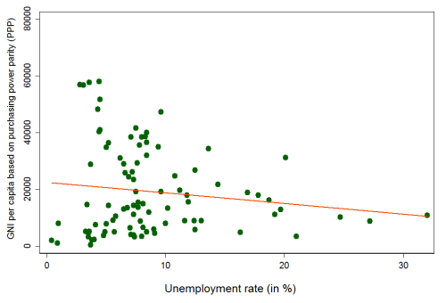
This graph does also show a weak relationship. But most people would probably agree that lower unemployment generally is good for economic growth. The point is: scatter plots are great because they are easy to comprehend, but they do not necessarily prove or disprove potential quantitative relationships. This is true in particular when countries and other bigger entities are being compared because they are already have such big initial differences.
Romei’s graph shows a weak relationship between female labor force participation rates and income per capita. One reason for that is that most of the countries with the highest female labor force participation rates do also happen to be poor. These are the ten countries in the world (according to the World Bank) with highest female labor force participation rates: Tanzania, Mozambique, Rwanda, Malawi, Burundi, Madagascar, Zimbabwe, Equatorial Guinea, Nepal, and Togo. Except for the extraction-based economy Equatorial Guinea, these are not precisely the richest countries in the world. One potential explanation is that in poor countries, many women have no choice but to work. This would be a case of reverse causation (where the dependent variable has an effect on the independent variable), and is one of those countering effects that was previously mentioned as a potential source of bias if we try to interpret Romei’s graph without further analysis.
What we are really interested in here is the counter-factual scenario. We know that Tanzania, Malawi and Zimbabwe are poor countries with high female labor force participation rates. What we want to know is whether they would higher, the same, or lower levels of income with a higher female labor force participation rate. Whether the United States has higher or lower income or/and female labor force participation rate than Spain is not particularly insightful; the interesting question is whether higher female labor force participation rate in the United States will boost American growth or not, everything else equal. And a cross-country scatter plot will not answer that question.
The following are a few very simple regression specifications. They are not meant to prove that higher female labor force participation causes higher income levels. The point is rather to show that an initially negative relationship quite easily can be turned into a positive relationship by taking some omitted variables into account.
 *** p<0.01. Robust (clustered where appropriate) standard errors in parentheses.
The dependent variable is income per capita in international dollars in terms of purchasing power parity (PPP). The main independent variable is female labor force participation rate in percent. The first column shows the result from the simplest of linear regressions. This result is different from the one depicted in Romei’s graph, because she finds a positive relationship between female labor force participation rate and income per capita whereas here the correlation is clearly negative. The result here implies that a one-percent increase in the female labor force participation rate is on average associated with a 51.91-dollar decrease in average annual income per capita. The reason that this result is negative whereas Romei’s is positive is probably because the data here is not only for 2010, but from 1990 to 2010 and it contains all observations available in the World Bank’s database for those years. See the following graph for comparison with Romei’s (although income per capita is the dependent variable, the axes are purposely swapped below for easier comparison with Romei’s original chart):

The three other columns in the table show regressions that include different combinations of fixed effects. The result in the third column in the table is insignificant. The results in the two other columns, however, show a fairly large and highly significant relationship between income per capita in terms of PPP and female labor force participation. This implies that when we allow for differences between countries that are more or less constant over time (such as culture and geography) the initially negative relationship becomes positive such that higher female labor force participation rates are associated with higher levels of income.
Now, these results are not really proof of anything that concerns the main hypothesis about causality, because the analysis here lacks both a causal identification strategy and robustness tests. The table above simply shows that many important economic questions – such as the one related to female labor force participation and economic development – are not easy to answer. Scatter plots and regression outputs may look convincing, but sometimes they cannot, regrettably, tell us much. This is true in particular when we compare big and vastly different entities, such as countries.
Simon Hedlin


